Sherwin Williams Pure White AI Preview That Actually Works in 2026
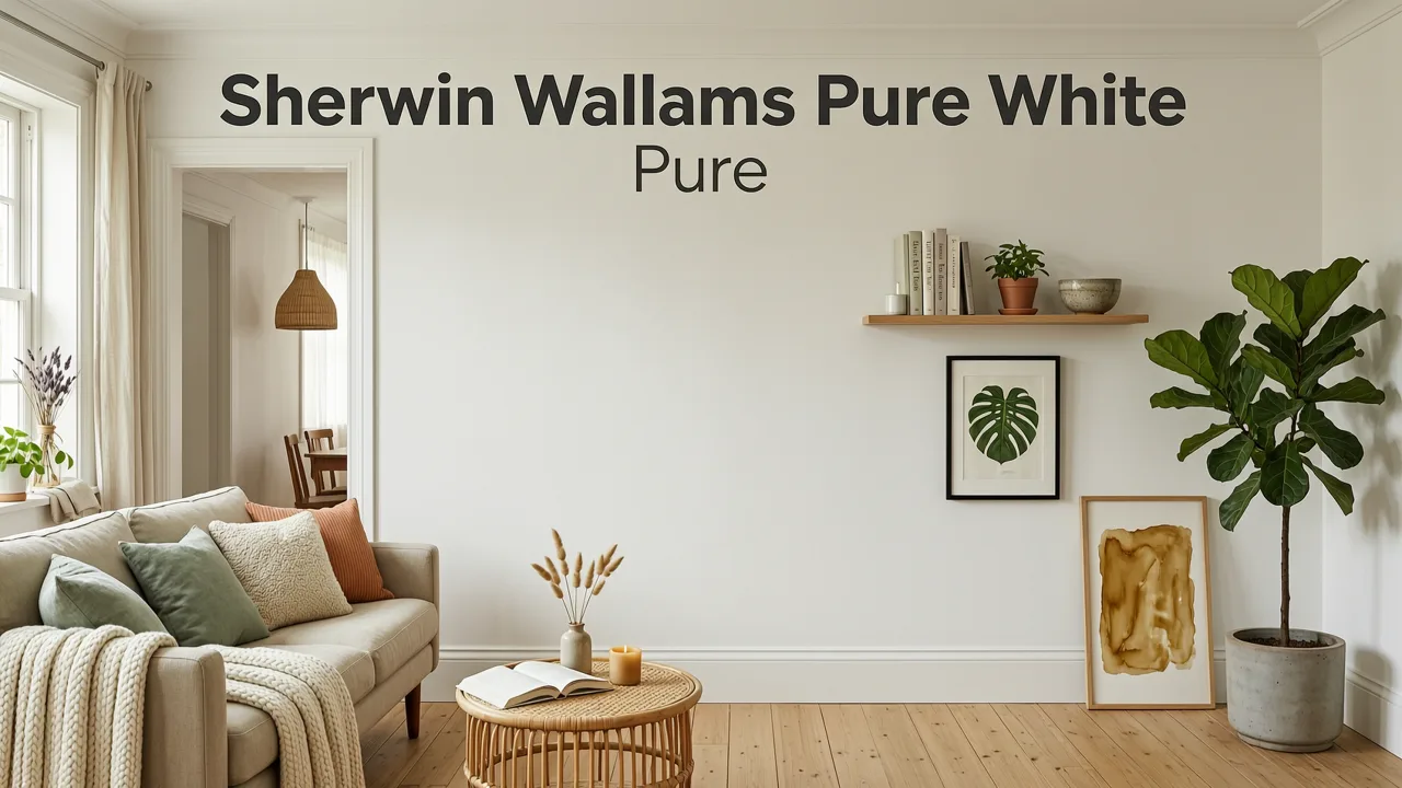
If you're searching for a Sherwin Williams Pure White AI preview in 2026, you're not just sampling a paint color — you're stress-testing one of the most popular neutrals in North America before spending a dime on primer, samples, or a painter. The fastest way to do it is to upload a single photo of your room or exterior into an AI interior design tool and watch Pure White (SW 7005) appear on your actual walls, trim, cabinetry, or siding in seconds.
This guide walks you through exactly how to generate that preview, what Pure White looks like under different lighting conditions, which rooms and architectural styles benefit most from it, and how to compare it against other near-white paints using AI visualization. No 3D modeling software. No waiting weeks for peel-and-stick swatches. Just your space, reimagined.
Why Sherwin Williams Pure White Remains a Top Paint Choice in 2026
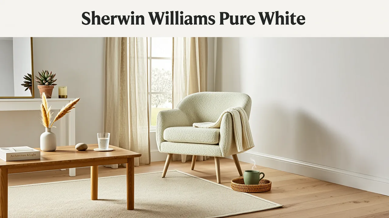
Sherwin Williams Pure White (SW 7005) has held its position as a go-to off-white for over a decade, and in 2026 it continues to dominate designer shortlists for good reason. It sits at an LRV of 84, which means it reflects a generous amount of light without crossing into the sterile, clinical territory that higher-LRV whites sometimes occupy. Its undertone is a soft, nearly neutral warm base with the faintest whisper of gray — enough to keep it from reading as yellow in south-facing rooms, yet warm enough to avoid feeling cold in north-facing spaces.
Sherwin Williams Pure White 7005: Paint Color Review
by Kylie M Interiors
That balancing act is precisely why Pure White works across such a wide range of applications: whole-house interiors, kitchen cabinetry, bathroom vanities, exterior trim, brick painting, and even modern farmhouse accents. It pairs with almost any flooring, countertop, or fixture finish, which is why homeowners and designers keep returning to it project after project.
What Makes Pure White Different from Alabaster and Extra White
Many buyers confuse Pure White with two other Sherwin Williams bestsellers: Alabaster (SW 7008) and Extra White (SW 7006). Here's the quick distinction:
- Alabaster is warmer, softer, and sits at an LRV of 82. It reads as a creamy white in dim light and can feel slightly beige in strong afternoon sun.
- Extra White is crisper, cooler, and sits at an LRV of 86. It reads as a true bright white and is often used on ceilings and trim for contrast.
- Pure White lands between them — warmer than Extra White, cleaner than Alabaster — making it the most versatile of the three for full-wall applications.
Seeing these differences on a screen is useful, but seeing them on your walls is what actually drives a confident decision. That's where AI preview tools change the game.
How to Generate a Sherwin Williams Pure White AI Preview Step by Step
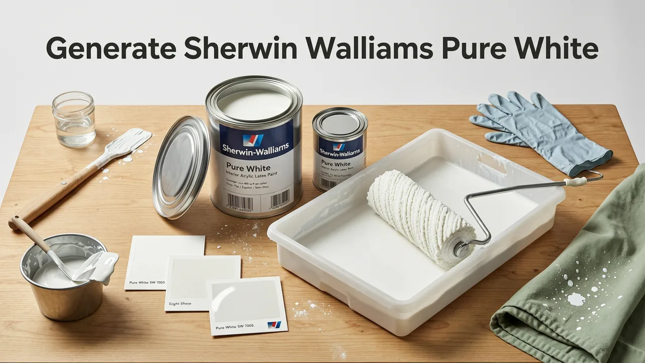
The process is straightforward and takes under a minute once you have a single photo ready. Here's the exact workflow:
- Take a well-lit photo of the room or exterior surface you want to visualize. Stand in a corner or at the far end of the space to capture maximum wall area. Avoid heavy wide-angle distortion if possible.
- Upload the photo into an AI interior design platform that supports custom color or style selection.
- Select a design style that matches your vision — for example, modern farmhouse, transitional, or Scandinavian — and specify Pure White as the target wall or trim color.
- Generate the preview. The AI maps the paint color onto your walls, respects existing shadows and perspective, and returns a photorealistic render in seconds.
- Compare variations. Run the same photo through two or three alternative whites to see how undertones shift against your specific flooring, furniture, and lighting.
The result is a true-to-room visualization that accounts for your actual window placement, ceiling height, and existing decor — something no physical swatch can replicate on its own.
What Pure White Looks Like Across Different Rooms
Pure White behaves differently depending on the room's function, light exposure, and surrounding materials. Below is a room-by-room breakdown of what to expect when you preview it through an AI tool.
Living Rooms
In living rooms with moderate-to-high natural light, Pure White reads as a clean, airy backdrop that lets furniture and artwork take center stage. It avoids the yellow cast that warmer whites can pick up from afternoon sun, and it doesn't flatten into gray the way cooler whites sometimes do in overcast conditions. If you're exploring a Scandinavian interior design approach for 2026, Pure White on walls paired with light oak flooring and linen textiles is a proven combination.
Kitchens
Pure White on kitchen cabinetry is one of its most popular applications. It provides enough warmth to feel inviting in a cooking space without clashing with warm-toned countertops like quartzite or butcher block. When you run a boho chic kitchen remodel with an AI preview, you'll see how Pure White upper and lower cabinets interact with terracotta tile, brass hardware, and open shelving — giving you a realistic sense of the finished space before ordering a single cabinet door.
Bedrooms
Bedrooms with north-facing windows can sometimes feel cool, and that's where Pure White's subtle warmth earns its keep. It keeps the room feeling calm and cocooning rather than institutional. Pair it with soft textiles and muted accent colors, and the AI preview will show you a space that feels restful without leaning into beige territory. For a more minimalist sleep environment, a Japandi bedroom design visualized with AI demonstrates how Pure White walls anchor natural wood and stone elements beautifully.
Bathrooms
In bathrooms, Pure White works exceptionally well on both walls and vanity cabinetry. It reflects light from overhead fixtures and mirrors, making small bathrooms feel larger. The key is to preview it alongside your tile selection — Pure White can read slightly warm against cool gray marble, which is either a desirable contrast or a mismatch depending on your goal.
Exteriors and Trim
Pure White is a leading choice for exterior trim, fascia, and even full-home siding in modern and craftsman-style architecture. It holds up well in direct sunlight without looking blown out, and it provides crisp contrast against darker body colors like charcoal, navy, or forest green. To see how it performs on your home's actual facade, you can use an AI exterior design tool to render Pure White trim against your existing brick, stone, or siding in minutes.
Sherwin Williams Pure White vs. Competing Whites: AI Comparison
Choosing a white paint is rarely about finding one good option — it's about finding the right one for your specific space. The table below compares Pure White against four other frequently considered whites across the attributes that matter most in an AI preview.
| Paint Color | Brand | LRV | Undertone | Best Use Case |
|---|---|---|---|---|
| Pure White | Sherwin Williams | 84 | Near-neutral, faint warm | Whole-home interiors, cabinetry, trim |
| Alabaster | Sherwin Williams | 82 | Warm, creamy | Cozy living spaces, traditional styles |
| Extra White | Sherwin Williams | 86 | Cool, crisp | Ceilings, trim contrast, modern spaces |
| White Dove | Benjamin Moore | 85 | Warm, soft greige | Transitional interiors, open floor plans |
| Chantilly Lace | Benjamin Moore | 90 | True white, minimal undertone | Bright rooms, gallery walls, ceilings |
When you run all five through an AI preview using the same room photo, the differences in undertone become immediately visible — particularly in shadowed corners and along edges where light hits at an angle. That side-by-side comparison is something no paint strip can deliver.
Lighting Conditions That Affect How Pure White Reads
Even the most versatile white paint shifts appearance depending on the light it receives. Understanding these shifts before you commit to a gallon — or an entire house — is what separates a confident color choice from an expensive regret.
North-Facing Rooms
North-facing light is cool and bluish. Pure White's subtle warmth prevents it from reading as flat or institutional in these spaces, which is a common complaint with cooler whites like Extra White or Chantilly Lace.
South-Facing Rooms
Southern exposure brings warm, golden light that can push warmer whites into yellow territory. Pure White generally holds its neutrality well here, but if your room has intense afternoon sun, previewing it with AI at different simulated times of day can reveal whether it stays clean or tips warm.
Open-Concept Spaces
In open floor plans where multiple light sources converge, Pure White's near-neutral character keeps it consistent from sightline to sightline. You won't get the jarring tonal shifts that sometimes happen when a warmer white meets a cool light source in an adjacent zone.
Artificial Lighting
Under 3000K warm LED bulbs, Pure White reads slightly cozier without crossing into cream. Under 4000K neutral LEDs, it stays true. Under 5000K daylight bulbs, it leans very slightly cool — but rarely enough to feel clinical. An AI preview tool that lets you adjust lighting temperature gives you a realistic sense of how the color will behave in your actual evening environment.
How AI Preview Technology Handles Paint Visualization in 2026
Modern AI interior design tools have evolved significantly from the flat color-overlay apps of a few years ago. Today's generation uses spatial understanding, lighting estimation, and material-aware rendering to place paint colors into your photo with far greater accuracy.
What the AI Actually Does
When you upload a room photo, the AI identifies wall planes, ceiling boundaries, trim lines, and architectural features. It then maps the selected color onto those surfaces while preserving existing shadows, reflections, and perspective geometry. The result is a render that looks like a photograph of your room after renovation — not a digital collage.
Limitations to Keep in Mind
AI previews are remarkably accurate for color visualization, but they are not a replacement for a physical sample in every scenario. Highly textured walls, rooms with extreme mixed lighting, or surfaces with existing glossy finishes may render slightly differently than the AI predicts. For critical decisions, use the AI preview to narrow your choices to two or three finalists, then order physical samples for those finalists.
Tips for Getting the Most Accurate Sherwin Williams Pure White AI Preview
The quality of your AI preview depends heavily on the quality of your source photo. Follow these guidelines to get results you can actually trust:
- Shoot in natural daylight. Turn off overhead lights and open all curtains before taking the photo. This gives the AI the most accurate baseline for how Pure White will interact with your room's existing light.
- Include surrounding materials. Make sure your flooring, countertops, and nearby furniture are visible in the frame. Pure White's undertone becomes apparent only in context with these elements.
- Avoid heavy HDR or filters. Phone cameras sometimes apply aggressive HDR processing that shifts white balance. Use the standard photo mode for the most color-accurate source image.
- Take multiple angles. Preview Pure White from at least two perspectives — one straight-on and one from a corner — to see how it reads across different wall planes and light angles.
- Run side-by-side comparisons. Most AI tools let you generate multiple versions of the same photo. Use this feature to compare Pure White against Alabaster, Extra White, or any Benjamin Moore equivalent in identical conditions.
Common Questions About Pure White and AI Visualization
Will Pure White look too cold on my kitchen cabinets?
In most kitchens, no. Pure White's faint warm undertone keeps it from reading as sterile on cabinetry, especially when paired with warm hardware finishes like brushed brass or oil-rubbed bronze. Previewing your specific kitchen through an AI tool will show you exactly how it interacts with your countertop and backsplash.
Can I use Pure White on both walls and trim?
Yes, and many designers recommend it. Using the same white on walls and trim creates a seamless, modern look that lets architectural details speak through shadow lines rather than color contrast. If you prefer subtle trim contrast, pair Pure White walls with Extra White trim.
Does Pure White work on exterior brick?
It can, though the result depends on your brick's existing texture and color. Lighter brick painted Pure White reads as a clean, updated craftsman look. Darker brick may require a primer tinted toward Pure White's undertone to achieve full, even coverage. An AI exterior preview lets you visualize the result before committing.
Final Thoughts on Previewing Pure White with AI
Sherwin Williams Pure White has earned its reputation as one of the most flexible, forgiving, and widely loved whites on the market. But reputation alone shouldn't drive your decision — your specific rooms, your specific light, and your specific furnishings should. An AI preview puts Pure White directly into your space in seconds, giving you the confidence to move forward with a paint purchase, a cabinet refinish, or a full exterior repaint knowing exactly what you'll get.
Upload your first photo today and see Sherwin Williams Pure White on your walls before a single brush hits the surface. The preview takes less than a minute — and it could save you from a very expensive wrong choice.