How to Visualize Textured Paint on Your Wall: The 2026 Quick Answer
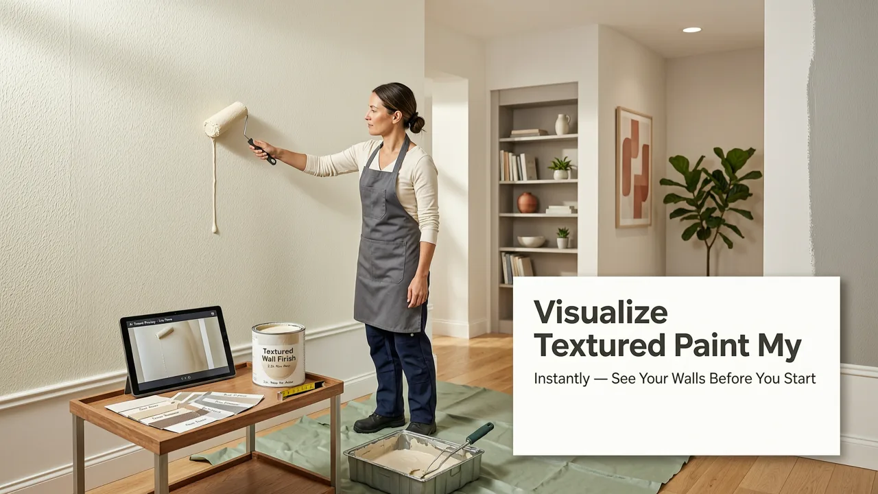
If you have been wondering how to visualize textured paint on your wall without buying sample pots or hiring a contractor, here is the short version: take a clear photo of your room, upload it to an AI-powered visualizer like AI Design Interiors, and select your texture style. Within seconds, you will see a photorealistic preview of stucco, limewash, Venetian plaster, or any other textured finish applied directly to your actual wall — no guesswork, no mess, no wasted weekend.
Textured paint has become one of the most requested wall treatments in 2026, but it is also one of the hardest to judge from a tiny swatch card. The way light catches a lime-washed surface, the depth of a troweled plaster, the subtle grain of a sand-finish coat — none of that translates to a flat paper sample. That is exactly why AI visualization tools have changed the game for homeowners, renters, and interior designers alike.
In this guide, I will walk you through every step of visualizing textured paint on your wall, explain which textures work best in different rooms, and show you how to avoid the most common mistakes people make when choosing a textured finish.
How to Texture a Wall (7 options) Do It Yourself
by Your New House
Why Visualizing Textured Paint Matters Before You Commit
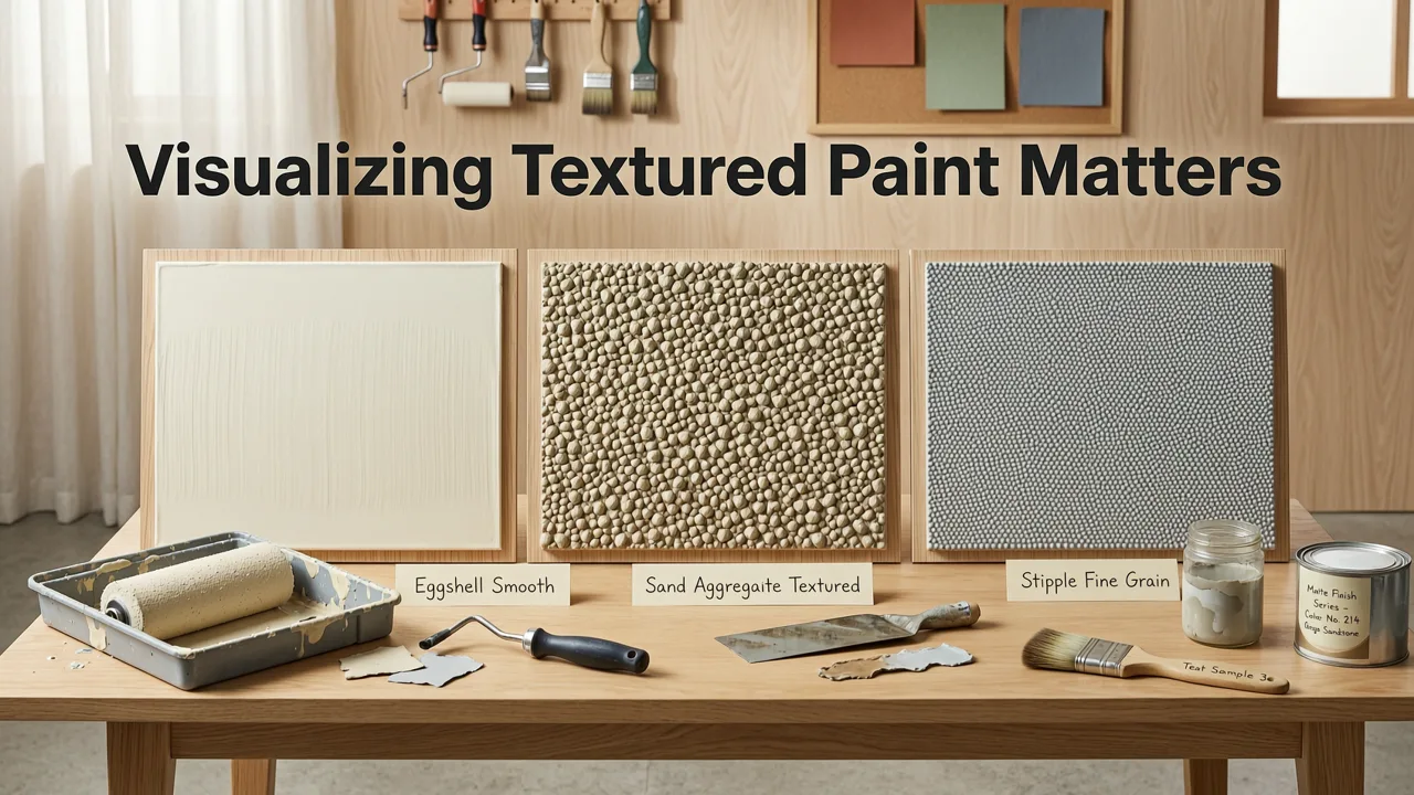
Textured paint is not like choosing a flat color. A smooth eggshell finish in "Swiss Coffee" looks nearly identical on a swatch and on the wall. But a Venetian plaster effect? A heavily troweled skip trowel? A coarse sand finish? Those vary dramatically depending on your room's lighting, wall dimensions, ceiling height, and even the color of your flooring.
Here is what most people discover the hard way:
- A texture that looks cozy in a showroom can feel overwhelming on four full walls.
- Lighter textures read very differently in north-facing light versus south-facing light.
- The same texture applied at different intensities produces completely different moods.
- Textured finishes interact with furniture, trim, and ceiling color in ways a sample card cannot predict.
Visualizing the texture on your actual wall — in your actual lighting conditions — eliminates nearly all of that uncertainty. It is the difference between spending $2,400 on a plaster finish you love and spending $2,400 on one you tolerate.
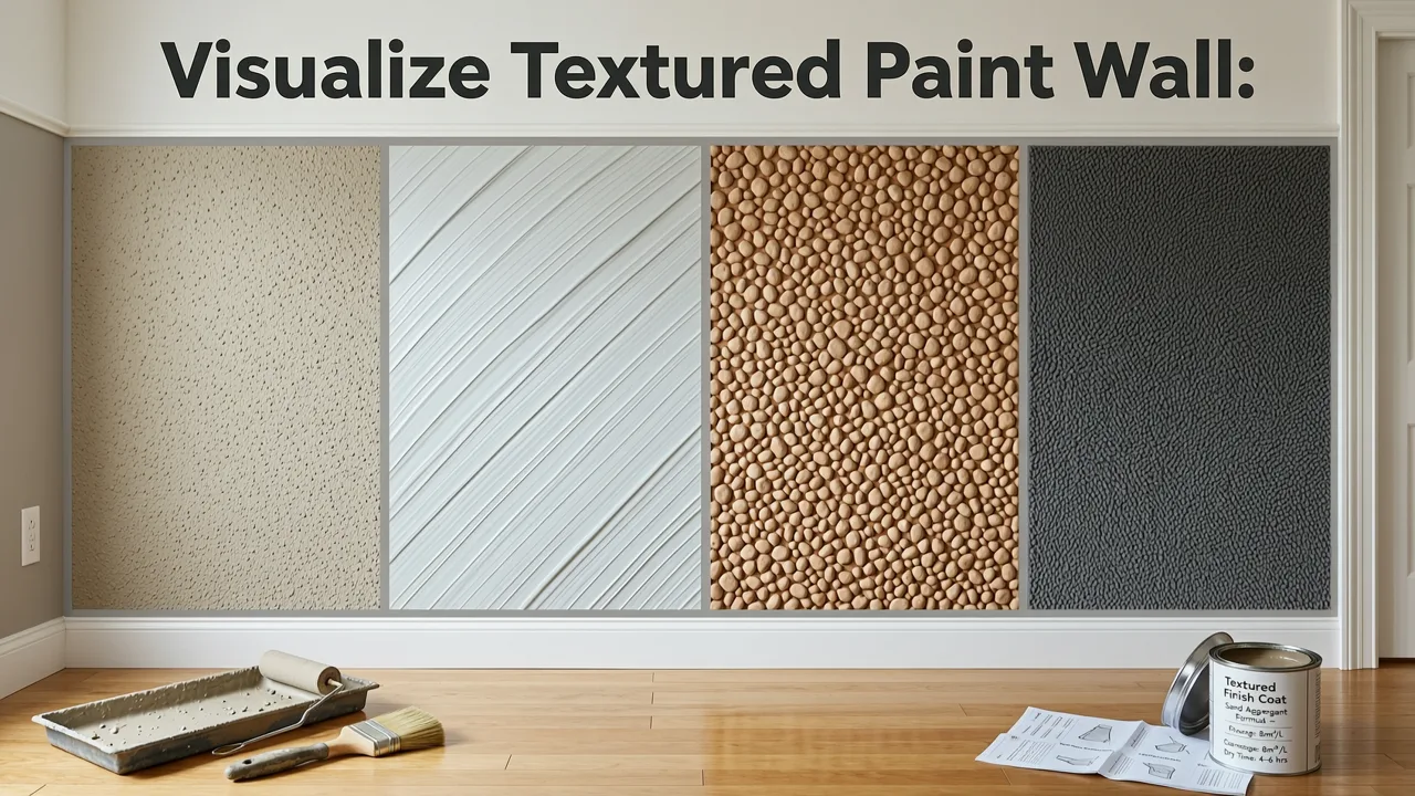
What Types of Textured Paint Can You Visualize with AI?
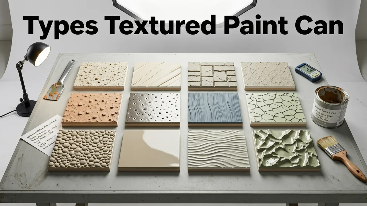
Modern AI visualization tools in 2026 can render a wide range of textured paint and wall finishes. Here are the most popular options homeowners are previewing right now:
Lime Wash
Lime wash creates a soft, cloud-like depth with subtle tonal variation. It is one of the most requested textured finishes in 2026 because it adds character without feeling heavy. AI visualizers handle lime wash exceptionally well because the effect is largely about color depth and light play.
Venetian Plaster
Venetian plaster delivers a polished, marble-like surface with visible trowel marks and a slight sheen. It works beautifully in formal living rooms, entryways, and dining rooms. When you visualize Venetian plaster on your wall, pay close attention to how the AI renders the reflective quality — that is the detail that separates a convincing preview from a flat one.
Skip Trowel and Spanish Knockdown
These are classic stucco-style textures that create a random, organic pattern of raised and flattened spots. They are popular in Southwestern and Mediterranean design schemes, and they work surprisingly well in modern spaces when applied in a neutral tone.
Sand Finish and Popcorn
Sand finish textures add a fine, uniform grain to walls. While popcorn ceilings have fallen out of favor, fine sand textures on walls remain popular for their ability to hide imperfections and add tactile interest.
Concrete and Microcement Look
The industrial concrete aesthetic continues to trend in 2026. AI tools can now simulate the mottled, matte appearance of microcement on your walls, giving you a realistic sense of how that raw, architectural look will feel in your space.
Orange Peel and Knockdown
These are the most common builder-grade textures. If you are trying to decide whether to keep your existing texture, upgrade to something smoother, or go bolder, visualizing each option on your wall is the fastest way to decide.
Step-by-Step: How to Visualize Textured Paint on Your Wall
Here is the exact process for generating a realistic textured paint visualization using an AI tool like AI Design Interiors.
Step 1 — Take a Clear Photo of Your Room
Use your phone camera and shoot straight-on. Avoid extreme wide-angle or fisheye lenses, which distort wall proportions. Make sure the wall you want to texture is well-lit and unobstructed. Move furniture away from the wall if possible, or at least ensure the wall surface is visible in the frame.
Good lighting matters. Natural daylight gives the most accurate preview. If you are shooting in the evening, turn on the same lights you typically use in the room so the AI can simulate how the texture will look under your normal lighting conditions.
Step 2 — Upload Your Photo to an AI Visualizer
Open your chosen AI design tool and upload the photo. Most platforms in 2026 process images in under ten seconds. The AI identifies the walls, ceiling, floor, and furnishings automatically, then allows you to apply textures to specific surfaces.
Step 3 — Select Your Texture Style
Browse the available texture library. Choose the finish you want to preview — lime wash, Venetian plaster, skip trowel, sand finish, or any other option. Some tools let you adjust the intensity of the texture, which is extremely helpful for comparing a subtle application versus a bold one.
Step 4 — Adjust Color and Intensity
Texture and color work together. A heavy knockdown texture in warm white reads very differently than the same texture in charcoal. Experiment with a few color pairings. If you are considering a warm neutral, this warm beige vs cool beige paint guide can help you narrow down the right undertone before you visualize.
Step 5 — Review and Compare
Generate multiple versions side by side. Most tools let you save several variations so you can compare textures, colors, and intensities without starting over. Share the images with family members, your contractor, or your designer to get feedback before spending money on materials.
Textured Paint vs Smooth Paint: A Quick Comparison
Not sure whether texture is the right direction for your wall? Here is a practical comparison to help you decide.
| Factor | Textured Paint | Smooth Paint |
|---|---|---|
| Visual Interest | High — adds depth and character | Moderate — relies on color alone |
| Hides Wall Imperfections | Excellent | Poor — shows every flaw |
| Application Difficulty | Higher — often requires a professional | Lower — DIY-friendly |
| Cost (per sq ft) | $4–$12+ depending on texture type | $1–$3 |
| Touch-Up Ease | Difficult — texture must be matched | Easy — roll on and blend |
| Best Rooms | Living rooms, entryways, accent walls, exteriors | Bedrooms, bathrooms, hallways, ceilings |
| Resale Impact | Polarizing — some buyers love it, some do not | Universally accepted |
If you are leaning toward texture but want a less permanent commitment, consider starting with an accent wall. This accent wall paint vs wallpaper comparison covers how different wall treatments perform in real spaces and can help you decide whether paint texture or another finish is the better fit.
How Lighting Affects Textured Paint Visualization
This is the single most overlooked factor when choosing a textured finish. Texture is essentially a play of light and shadow. The same wall can look dramatically different at 8 AM versus 8 PM, and the AI visualizer can help you account for that.
Natural Light Direction
Walls facing north receive cooler, more even light, which tends to soften texture appearance. South-facing walls get warm, direct light that emphasizes texture peaks and valleys. If your room gets strong afternoon sun, a heavy texture will cast more pronounced shadows than your morning preview might suggest.
Artificial Light Type
Recessed can lights, wall sconces, and track lighting all interact with textured surfaces differently. Grazing light — light that hits the wall at a shallow angle — will make texture appear much more pronounced. If you have wall-wash fixtures, expect your texture to read more subtly.
Using the AI to Test Lighting Scenarios
Many 2026 AI visualizers let you adjust the simulated lighting in your preview. Take advantage of this feature. Preview your textured wall under warm evening light, cool midday light, and mixed ambient conditions. If the texture still looks right in all three scenarios, you have found a winner.
Common Mistakes People Make When Choosing Textured Paint
After reviewing thousands of room visualizations, a few patterns stand out. Here is what to avoid.
Choosing Texture Based on a Tiny Sample
A four-inch sample board does not represent what a texture looks like at scale. The pattern repeats, the shadows multiply, and the overall effect intensifies. Always visualize on a full wall before committing.
Ignoring the Ceiling and Trim
Textured walls change the visual weight of a room. A heavily textured wall paired with a smooth white ceiling and crisp trim creates a specific look. The same wall paired with a textured ceiling and ornate trim creates a very different one. Visualize the whole room, not just the wall.
Forgetting About Touch-Ups
Textured walls are harder to patch than smooth ones. If you have young children, pets, or high-traffic areas, consider whether you are prepared for the maintenance. Some textures, like lime wash, develop a patina over time that actually improves with wear. Others, like a precise skip trowel, show every repair.
Applying Too Much Texture in Small Rooms
Heavy textures in small powder rooms or narrow hallways can feel cavernous and busy. In compact spaces, a subtle lime wash or fine sand finish usually delivers more impact than an aggressive stucco pattern.
Visualizing Textured Paint on Exteriors
Textured finishes are not just for interior walls. Exterior stucco, EIFS, and textured coatings are standard in many regions, and choosing the right one matters just as much. If you are evaluating exterior textures, the DrHomey Exterior Design tool lets you preview stucco and textured finishes on your actual home photo, accounting for sunlight, surrounding landscaping, and architectural style.
Exterior textures face additional considerations: climate durability, moisture resistance, and long-term maintenance. A texture that looks beautiful in a visualization might trap moisture in a humid climate or show dirt more readily in a dusty environment. Use the visualizer to narrow your options, then confirm with your contractor that the finish is appropriate for your region.
How AI Textured Paint Visualization Works Under the Hood
For the technically curious, here is a brief overview of how these tools generate realistic textured wall previews in 2026.
Modern AI visualizers use a combination of semantic segmentation and diffusion-based rendering. The system first identifies the wall surfaces in your photo, separating them from furniture, flooring, windows, and trim. It then applies a texture layer that respects the existing geometry, shadows, and perspective of the room.
The latest generation of models also accounts for material properties like reflectance and surface roughness. That is why a Venetian plaster preview looks convincingly different from a matte lime wash — the AI simulates how each material interacts with light, not just how it looks as a flat overlay.
These systems are built on foundation models documented in resources like the OpenAI documentation and follow responsible deployment practices outlined in the Google AI guidance. The result is a preview that is accurate enough to make confident design decisions without stepping into a store.
Tips for Getting the Most Accurate Visualization
To ensure your textured paint preview is as realistic as possible, follow these best practices:
- Use a high-resolution photo. Blurry images produce blurry previews. Clean your camera lens and shoot in good light.
- Shoot straight on. Angled shots distort wall proportions and make the texture look uneven.
- Include surrounding surfaces. The AI needs context — floor, ceiling, and adjacent walls — to render the texture realistically.
- Try multiple textures before deciding. Do not stop at the first option. Compare at least three textures in the same color to see which feels right.
- Share the preview with your painter. A professional can tell you whether the texture you are visualizing is achievable with your wall type and budget.
When to Use a Free Paint Visualizer vs a Full Design Tool
If you are only testing color on a single accent wall, a free accent wall paint visualizer may be all you need. These lightweight tools are fast, simple, and perfect for quick color checks.
But if you are exploring textured finishes, testing multiple rooms, or working on a full-home redesign, a comprehensive AI design platform gives you significantly more control. You can adjust texture intensity, swap between multiple wall treatments, visualize entire room makeovers, and even preview exterior applications — all from a single photo upload.
Final Thoughts on Visualizing Textured Paint
Choosing a textured paint finish is one of those decisions that feels high-stakes because it is expensive to reverse. The good news is that you no longer have to rely on swatches, sample boards, and wishful thinking. With AI-powered visualization, you can see exactly how stucco, lime wash, Venetian plaster, or any other textured finish will look on your actual wall, in your actual room, under your actual lighting — in a matter of seconds.
Take the photo, run the preview, compare your options, and walk into your project with confidence. Your walls — and your budget — will thank you.
Ready to see textured paint on your wall right now? Upload a room photo to AI Design Interiors and generate your first photorealistic textured wall preview in under a minute.