Why Choosing the Right White Interior Wall Paint Shades Is Complex
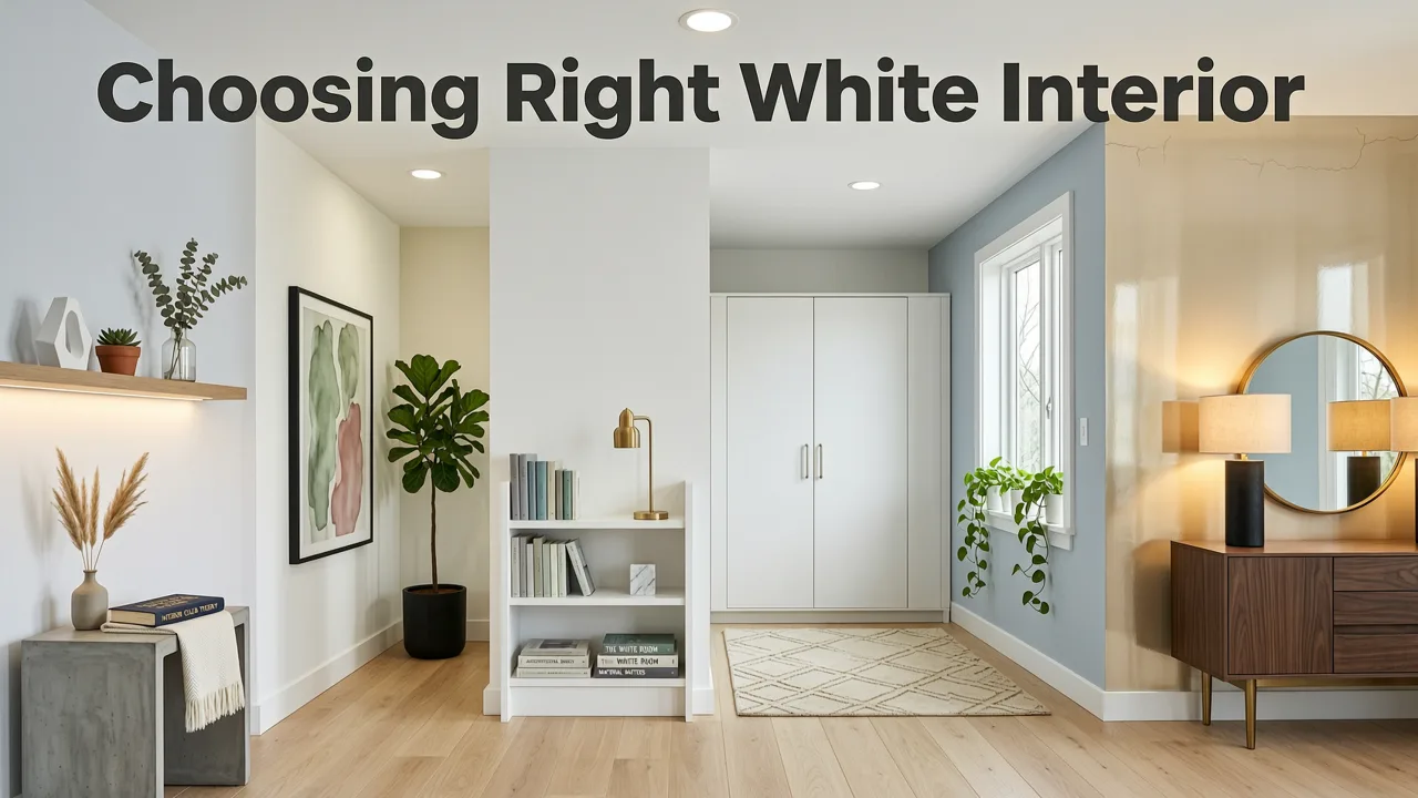
Selecting the right white interior wall paint shades is one of the most common challenges in home design. While white seems like a simple, foolproof choice, the sheer volume of options can make a room feel clinical, yellow, or unexpectedly gray depending on the time of day. The short answer to finding the perfect white is to analyze the room's natural light, identify the underlying undertones of the paint, and use modern AI visualization tools to preview the color in your actual space before buying a single gallon.
White is rarely just white. Paint manufacturers create hundreds of variations by mixing pure white bases with microscopic drops of other colors. These subtle additions create undertones that dramatically change how the paint behaves in your specific environment. Understanding color theory and lighting is the first step toward a successful room makeover.
How Lighting Dictates the Appearance of White Paint
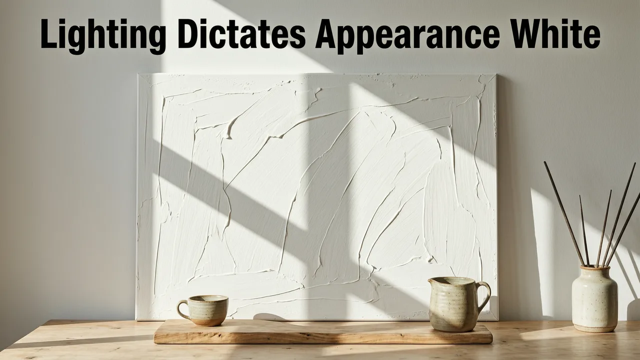
The most critical factor in choosing a white paint shade is the direction your room faces. Natural light changes the temperature of the room throughout the day, which in shifts the appearance of the paint on your walls.
I tried every white paint… these 6 are the best
by The Paint People
North-Facing Rooms
Rooms with north-facing windows receive indirect, cooler light that often carries a slight blue or gray cast. If you paint a north-facing room with a cool white, the space can feel chilly and sterile. Designers typically recommend warm whites with subtle yellow or red undertones to balance the cool natural light and create a welcoming atmosphere.
South-Facing Rooms
South-facing rooms are flooded with warm, intense sunlight for most of the day. This abundant warm light amplifies the undertones in paint. If you use a warm white in a south-facing room, it may look overwhelmingly yellow or peachy during peak afternoon hours. Cool whites or crisp, neutral whites work beautifully here, as the natural sunlight prevents them from feeling cold.
East and West-Facing Rooms
East-facing rooms receive warm, yellowish light in the morning and cooler light in the afternoon. West-facing rooms experience the opposite, with cooler light in the morning and intense, warm light in the late afternoon. These variable conditions require versatile, neutral whites that do not lean too heavily in any direction, ensuring the room looks balanced from dawn to dusk.
Top White Interior Wall Paint Shades by Undertone
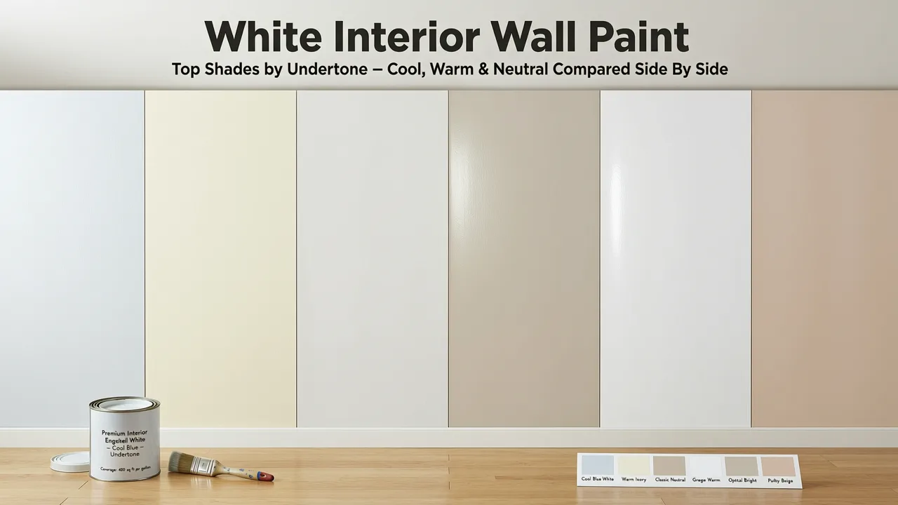
To simplify the selection process, it helps to categorize popular white interior wall paint shades by their underlying color profiles. Below is a breakdown of the three main categories and how they function in a space.
Warm Whites
Warm whites contain subtle hints of yellow, red, or orange. They are ideal for creating cozy, inviting environments and pair exceptionally well with natural wood tones, warm metallics like brass or copper, and earthy textiles. They prevent north-facing rooms from feeling gloomy.
Cool Whites
Cool whites are mixed with traces of blue, gray, or green. They evoke a clean, crisp, and modern aesthetic. Cool whites are highly reflective and work well in contemporary designs, south-facing rooms, and spaces where a sharp, tailored look is desired.
True and Neutral Whites
Neutral whites sit exactly in the middle of the spectrum. They lack obvious warm or cool undertones, making them the most adaptable choice. They provide a clean backdrop that allows furniture, artwork, and architectural details to take center stage without competing with the wall color.
| Paint Shade Category | Example Shade Name | Primary Undertone | Best Room Orientation | Visual Effect |
|---|---|---|---|---|
| Warm White | White Dove | Subtle Yellow/Gray | North or East-facing | Soft, inviting, and cozy |
| Cool White | Chantilly Lace | Crisp Blue/Clean | South or West-facing | Bright, modern, and sharp |
| Neutral White | Simply White | Minimal/Balanced | Any orientation | Versatile, clean, and fresh |
| Warm White | Swiss Coffee | Creamy Yellow/Brown | North-facing | Earthy, warm, and traditional |
| Cool White | Decorator's White | Subtle Gray | South-facing | Elegant, structured, and bright |
Visualizing White Paint with AI Technology
Historically, homeowners relied on physical paper swatches or painting large foam boards to test white paint. This process is time-consuming, messy, and often inaccurate because a small swatch cannot replicate how light wraps around an entire room. In 2026, the industry standard has shifted toward digital white wall paint AI visualization.
AI visualization tools allow you to upload a photograph of your room and instantly apply different paint shades to the walls. The software analyzes the geometry of the space, identifies the walls, and calculates how shadows and existing light sources will interact with the new color. This provides a photorealistic preview that accounts for your specific furniture, flooring, and window treatments.
Practical Steps for Testing Paint in Your Space
Using AI tools effectively requires a strategic approach. Follow these steps to ensure your final paint choice is perfect.
- Assess the Room Dimensions and Light: Before opening any design tool, evaluate the size of your space. If you are working with a compact area, understanding how light reflects is critical. You can explore specialized guidance on choosing the best white paint for small rooms to maximize the perception of space.
- Upload and Visualize: Take a clear, well-lit photo of your room. Use a free accent wall paint visualizer or a full-room AI tool to test multiple white shades simultaneously. Apply the colors to your main walls or test how a crisp white looks as an accent wall against darker trim.
- Evaluate the Context: Look at how the AI renders the paint next to your existing flooring and cabinetry. A white that looks perfect on its own might clash with the orange undertones of oak floors or the gray veins in marble countertops.
- Consider Data Privacy: When uploading interior photos to any cloud-based AI service, it is important to use platforms that prioritize user privacy. Reputable AI design applications adhere to strict data handling guidelines, similar to the ethical frameworks outlined in Google AI responsibility principles, ensuring your personal home images remain secure and are not used to train public models without consent.
Common Mistakes to Avoid When Choosing White Paint
Even with the best tools, a few common pitfalls can lead to a disappointing result. Avoid these errors to ensure a smooth renovation process.
- Ignoring the Finish: The sheen of the paint affects how the color is perceived. A high-gloss white will reflect more light and appear brighter and slightly cooler, while a matte finish absorbs light and can make the same shade look softer and warmer.
- Testing in Poor Light: Never choose a paint shade based solely on the fluorescent lighting of a hardware store. Always view your AI visualizations or physical swatches in the actual lighting conditions of the room.
- Forgetting the Trim and Ceiling: Using the exact same white on the walls, trim, and ceiling can make a room feel flat. Consider using a slightly brighter or cooler white for the trim to create subtle contrast and highlight architectural details.
Final Thoughts on Selecting the Perfect White
Choosing the right white interior wall paint shades requires a balance of color theory, environmental awareness, and modern technology. By understanding how undertones interact with natural light and leveraging AI visualization to preview the results, you can eliminate the guesswork from your renovation. Whether you prefer the cozy embrace of a warm white or the crisp elegance of a cool, neutral shade, taking the time to visualize the color in your actual space ensures a beautiful, lasting result.
Ready to see how different whites will transform your home? Upload a photo of your room to our AI interior design platform and instantly preview dozens of paint shades in a photorealistic, true-to-room environment.