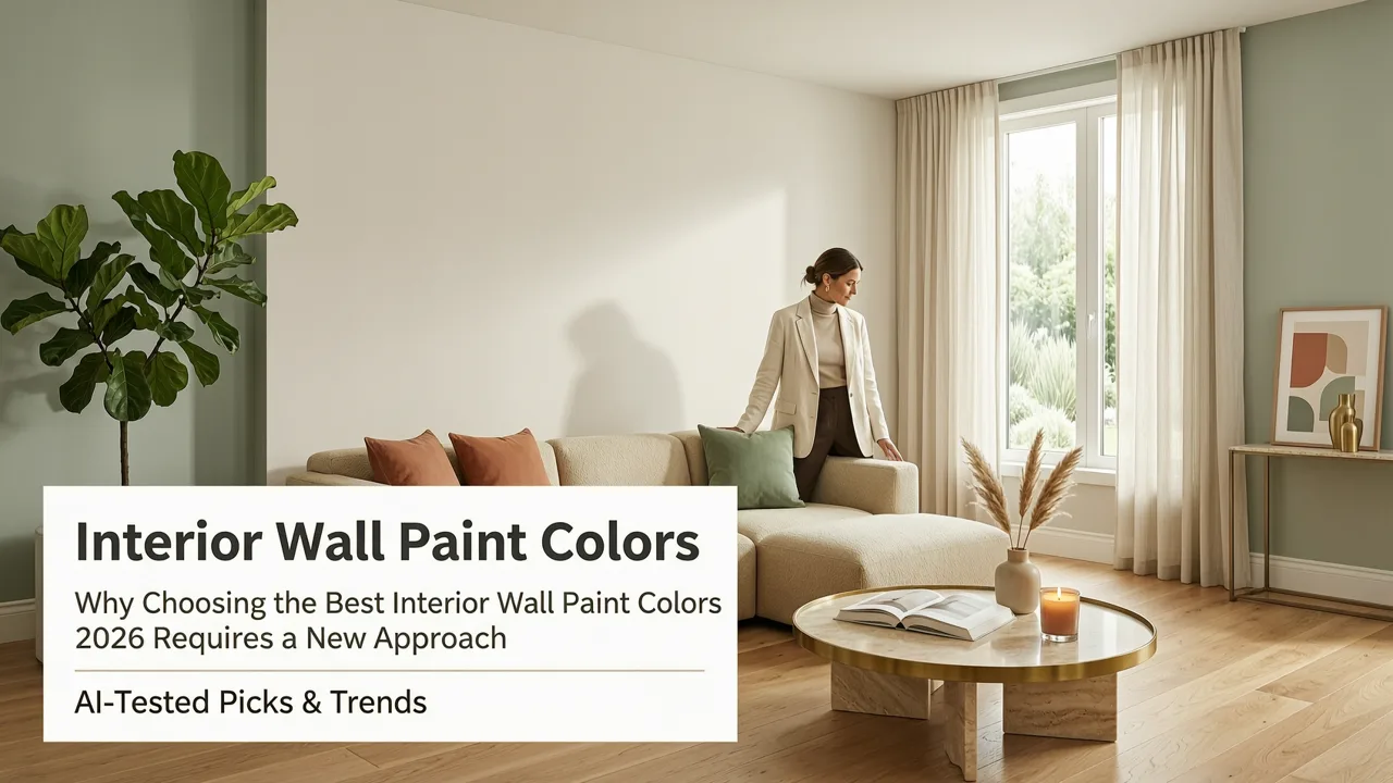
Why Choosing the Best Interior Wall Paint Colors 2026 Requires a New Approach
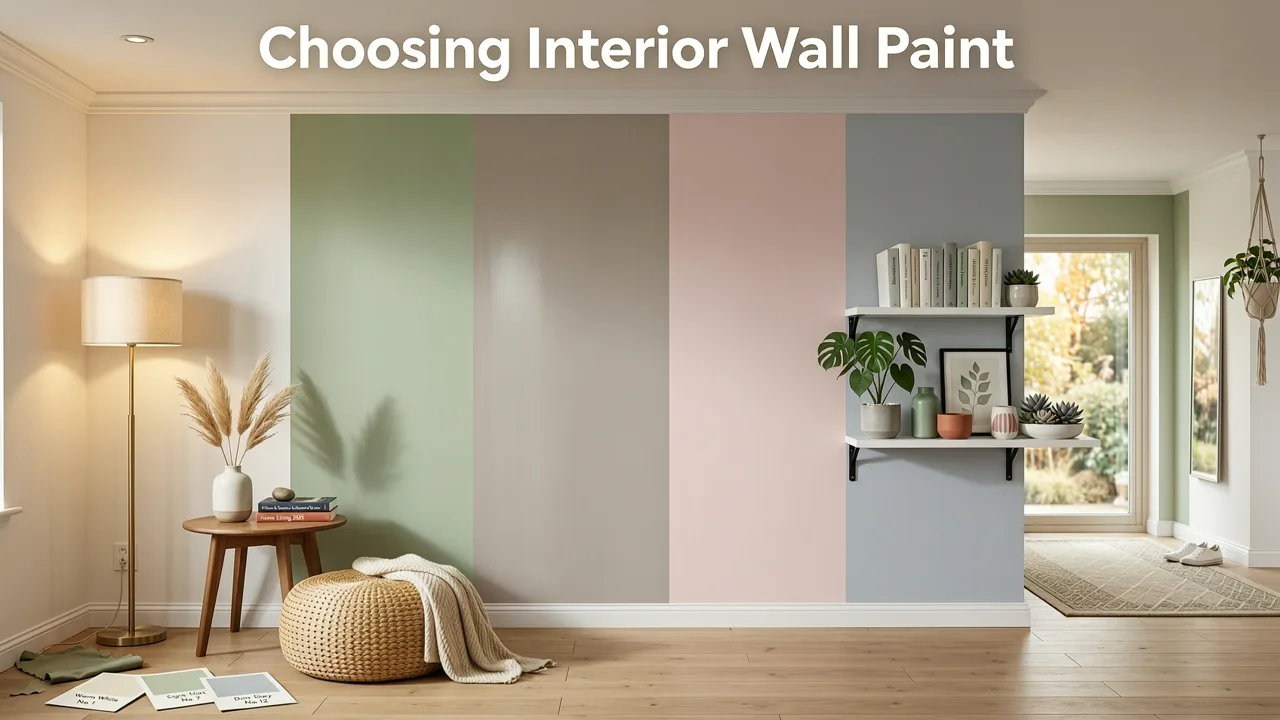
Selecting the right paint is the most impactful yet intimidating part of a room makeover. The best interior wall paint colors 2026 has to offer blend psychological comfort with architectural harmony, moving decisively away from the stark, clinical tones of the previous decade toward grounded, nature-inspired palettes. Whether you are refreshing a single bedroom or reimagining an entire home, understanding this year's top shades and how they interact with your specific lighting is essential before buying a single gallon.
In the past, homeowners relied almost entirely on physical paper swatches, which often failed to account for the complex interplay of natural light, artificial fixtures, and surrounding furniture. Today, the integration of artificial intelligence into interior design means we can predict color behavior with unprecedented accuracy. By leveraging spatial computing and advanced rendering, modern tools analyze room geometry to show exactly how a pigment will shift from morning to dusk, eliminating the costly guesswork of traditional paint selection.
The Top Interior Wall Paint Color Trends for 2026
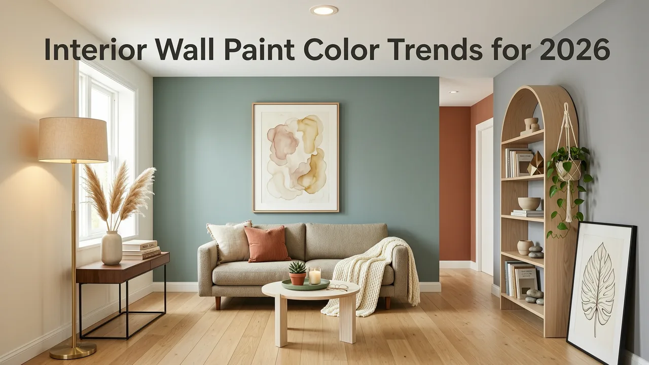
The design landscape in 2026 is defined by a desire for sanctuary and organic connection. The most sought-after shades reflect the natural world, offering a sense of calm and permanence in an increasingly digital environment. Here are the defining color families dominating interior spaces this year.
Top Interior Paint Colors for 2026 | Interior Designer Favorites
by Ashley Childers
1. Warm Earthy Neutrals (The Evolution of Greige)
The cool, stark grays of the 2010s have officially been retired. In their place, warm earthy neutrals have taken center stage. These shades blend the versatility of beige with the grounding depth of clay and sand. They provide a warm, enveloping backdrop that makes spaces feel inviting rather than sterile. These colors are particularly effective in open-concept living areas, where they create a seamless flow between different functional zones without overwhelming the senses.
2. Moody, Nature-Inspired Greens and Blues
For those looking to add depth and drama, deep botanical greens and oceanic blues are the premier choices. Shades like forest moss, deep sage, and midnight navy are being used to create intimate, cocoon-like environments. These colors work exceptionally well in studies, libraries, and dining rooms, where a sense of focus and sophistication is desired. When applying these richer hues, many homeowners debate whether to use paint or wall coverings. Understanding the accent wall paint vs wallpaper dynamic helps you decide which method best suits your texture and budget requirements.
3. Soft, Whispering Whites and Creams
White is never truly out of style, but the formulation has changed. The best interior wall paint colors 2026 features whites that are heavily undertoned with yellow, red, or green to prevent them from looking flat or institutional. These whispering whites and warm creams reflect light beautifully while maintaining a soft, organic feel. If you are working with limited square footage, pairing these creamy shades with the right finish is crucial; explore more strategies in our guide on the best white paint for small rooms.
4. Terracotta and Baked Clay Accents
Bringing the warmth of the Mediterranean and the American Southwest indoors, terracotta and baked clay tones are highly popular for accent walls and cabinetry. These earthy reds and oranges stimulate conversation and appetite, making them ideal for kitchens and social gathering spaces. They pair beautifully with natural wood tones, brushed brass hardware, and textured linen fabrics.
How Lighting Dictates the Success of the Best Interior Wall Paint Colors 2026
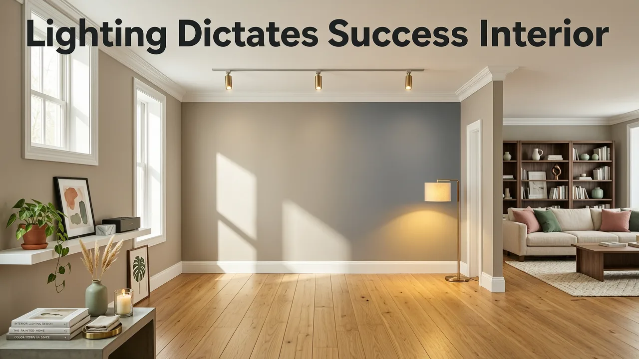
A paint color that looks flawless in a showroom can look entirely different in your home. This is due to Light Reflectance Value (LRV), which measures the percentage of light a color reflects. A high LRV bounces light around a room, making it feel airy, while a low LRV absorbs light, creating a cozy but potentially cavernous effect.
The orientation of your windows plays a massive role in how these colors behave. North-facing rooms receive cool, bluish light, which can make warm neutrals look slightly muddy and cool grays look icy. South-facing rooms bathe in warm, golden light, which can intensify warm colors and mute cool ones. East-facing rooms feature warm morning light and cool afternoon light, while west-facing rooms experience the opposite.
Modern AI interior design platforms rely on advanced spatial computing models, similar to those detailed in OpenAI documentation, to interpret room geometry and map color accurately. By analyzing the angles of your walls and the placement of your windows, these systems can simulate how sunlight will interact with specific LRV values throughout the day, ensuring your chosen shade performs exactly as intended.
Visualizing the Best Interior Wall Paint Colors 2026 with AI Technology
Gone are the days of taping dozens of paper swatches to your wall and staring at them for hours. AI-powered visualization tools have revolutionized the renovation planning process, allowing you to see photorealistic previews of your space in seconds.
The Advantage of AI Over Physical Swatches
Physical swatches only show you a tiny fraction of the wall, isolated from your furniture, flooring, and architectural details. AI visualization, on the other hand, renders the color across the entire surface of your actual room. It accounts for shadows cast by furniture, the gloss of your flooring, and the ambient light bouncing off your existing decor. Testing lighter shades is particularly sensitive to lighting nuances, which is why white wall paint AI visualization tools have become indispensable for achieving a flawless, shadow-free look.
How to Test Colors in Your Actual Room
Using an AI design tool is a straightforward process that yields professional-grade results.
- Capture a High-Quality Photo: Take a clear, well-lit photograph of the room you wish to redesign. Ensure the entire wall and surrounding context are visible.
- Upload to the AI Platform: Import your photo into the visualization software. The AI will automatically detect the boundaries of the walls, ceilings, and floors.
- Select Your 2026 Palette: Browse through the curated trending shades or input specific brand color codes. The AI will map the pigment onto your walls, respecting the existing shadows and textures.
- Adjust and Refine: Toggle between different times of day to see how the color shifts under various lighting conditions. Compare multiple shades side-by-side without making a mess.
Furthermore, ethical and responsible AI deployment, as outlined in Google AI guidance, ensures that these visualization tools process user-uploaded room photos securely and privately, giving you peace of mind while you experiment with your design.
Selecting the Right Paint Finish for Your Chosen Shade
Color is only half the equation; the finish determines how the paint interacts with light and withstands daily wear. A matte finish will absorb light and make a dark moody green look velvety and rich, while a semi-gloss finish will reflect light and make the exact same color look brighter and more saturated.
Use the table below to match the correct sheen to your chosen 2026 color and room function.
| Paint Finish | Light Reflection | Best Use Cases | Compatibility with 2026 Trends |
|---|---|---|---|
| Matte / Flat | Absorbs light, hides imperfections | Adult bedrooms, formal dining rooms, ceilings | Perfect for moody greens and deep blues to create a velvety, sophisticated look. |
| Eggshell | Soft, subtle glow | Living rooms, hallways, guest bedrooms | Ideal for warm earthy neutrals; provides a gentle warmth without looking shiny. |
| Satin | Smooth, pearl-like finish | Kitchens, family rooms, kids' bedrooms | Great for terracotta accents in high-traffic areas where occasional wiping is needed. |
| Semi-Gloss | Highly reflective, durable | Trim, doors, cabinets, bathrooms | Best used for crisp white trims contrasting against warm 2026 wall colors. |
| High-Gloss | Mirror-like, ultra-reflective | Accent ceilings, furniture, specialized decor | Used sparingly for dramatic, modern contrast against soft whispering whites. |
Final Thoughts on Curating Your 2026 Color Palette
The best interior wall paint colors 2026 has introduced represent a return to warmth, nature, and psychological comfort. By moving away from fleeting, hyper-modern trends and embracing organic neutrals, deep botanicals, and earthy clay tones, you can create spaces that feel both timeless and deeply personal. However, the true success of any paint color relies on understanding how it interacts with your unique architectural lighting and spatial geometry.
Relying on AI-powered visualization eliminates the anxiety of paint selection, allowing you to make confident, data-backed decisions before a brush ever touches your wall. Ready to see how these trending shades look on your actual walls? Try our free accent wall paint visualizer to upload a photo and instantly preview your makeover with photorealistic accuracy.