Accent Wall Paint Ideas 2026: See Your Space Transformed Before You Lift a Brush
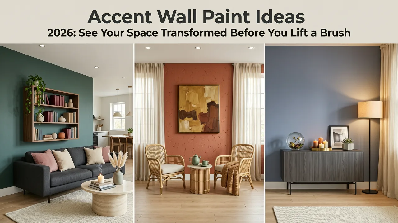
If you have been scrolling through paint swatches for hours and still cannot decide which color will look right on your wall, you are not alone. Accent wall paint ideas for 2026 are bolder, more textured, and far more personalized than the safe neutrals of the early 2020s—and the fastest way to test them is no longer buying sample pots and taping squares of paper to your wall. With AI-powered visualization tools, you can now upload a photo of your room and see dozens of accent wall colors rendered in photorealistic detail in seconds.
This guide walks you through 25 accent wall paint ideas trending in 2026, organized by mood and room type, with practical pairing advice so you can move from inspiration to action without wasting paint, time, or money.
Why Accent Walls Still Matter in 2026
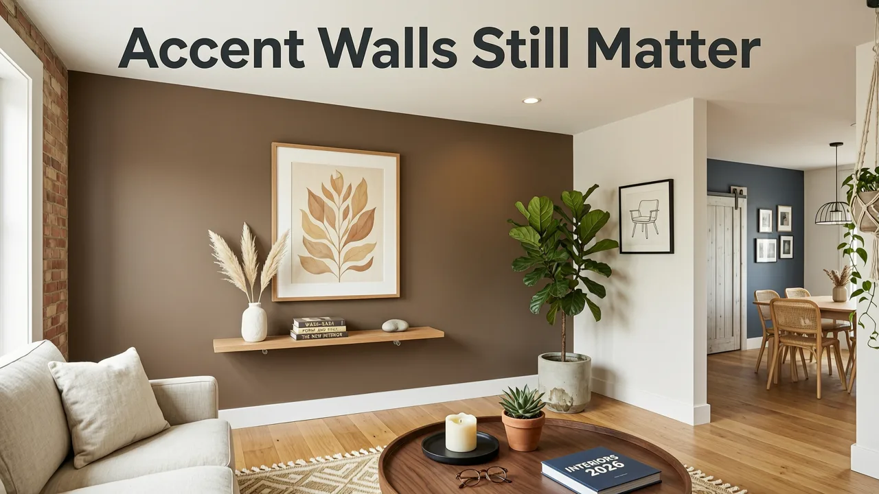
The accent wall is not going anywhere. What has changed is how designers and homeowners approach it. In 2026, accent walls are less about a single loud color and more about intention—using paint to define zones, add warmth, or create a visual anchor in open-plan layouts. The trend has shifted from "one wall in a shocking hue" to a more considered approach where color, finish, and architectural features work together.
Top Interior Paint Colors for 2026 | Interior Designer Favorites
by Ashley Childers
Several forces are driving this shift:
- Open-plan fatigue. Homeowners want defined zones without building walls, and a well-chosen accent wall does that effortlessly.
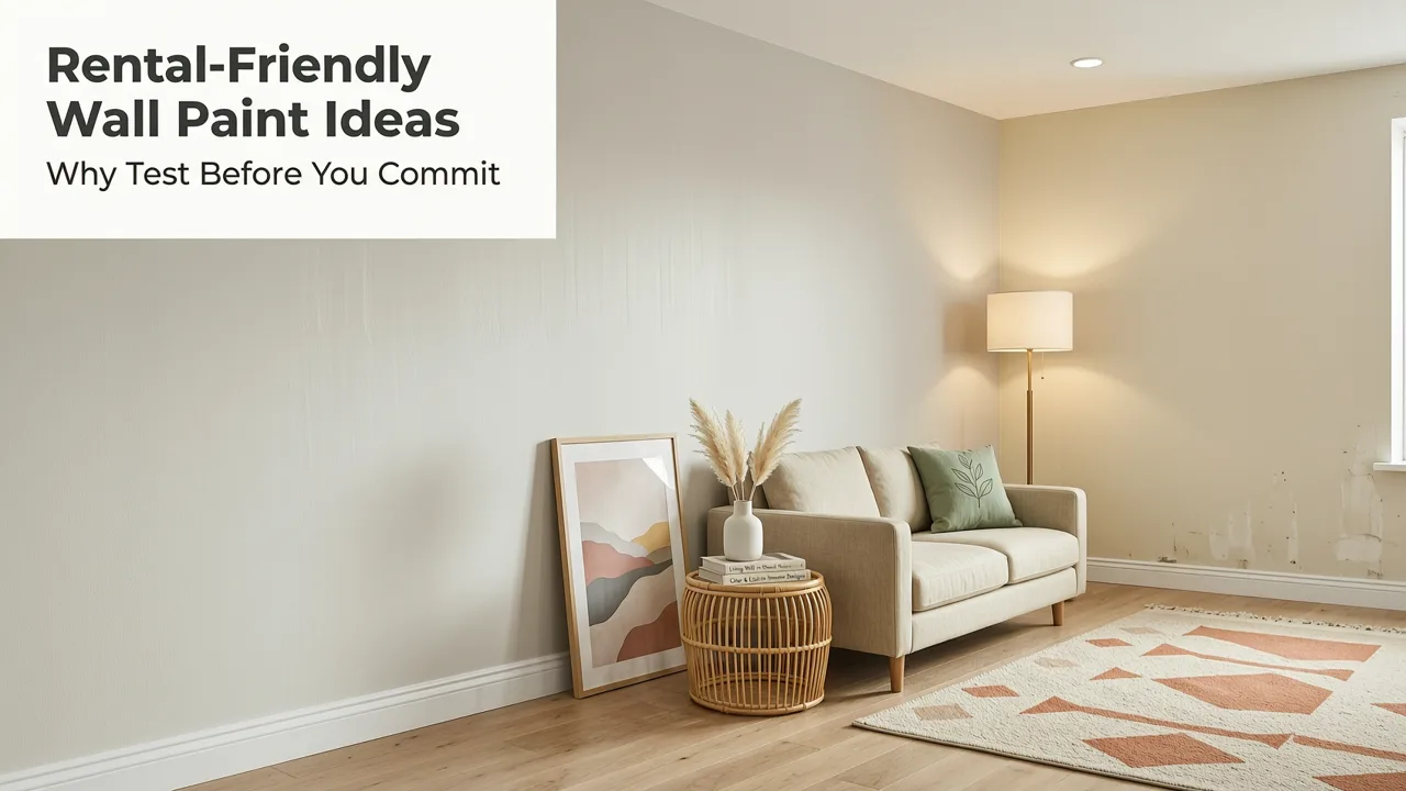
- Rental-friendly upgrades. Renters who cannot renovate can still transform a room with paint—and reverse it when they leave.
- AI visualization tools. Seeing a color in your actual room before committing removes the guesswork that used to make accent walls risky.
- Biophilic and earthy palettes. Nature-inspired tones continue to dominate, but with richer saturation and more complex undertones than before.
Whether you are refreshing a bedroom, staging a living room for sale, or rethinking your home office, the ideas below are organized to help you find a direction that fits your space and your lifestyle.
How to Choose the Right Accent Wall in 2026
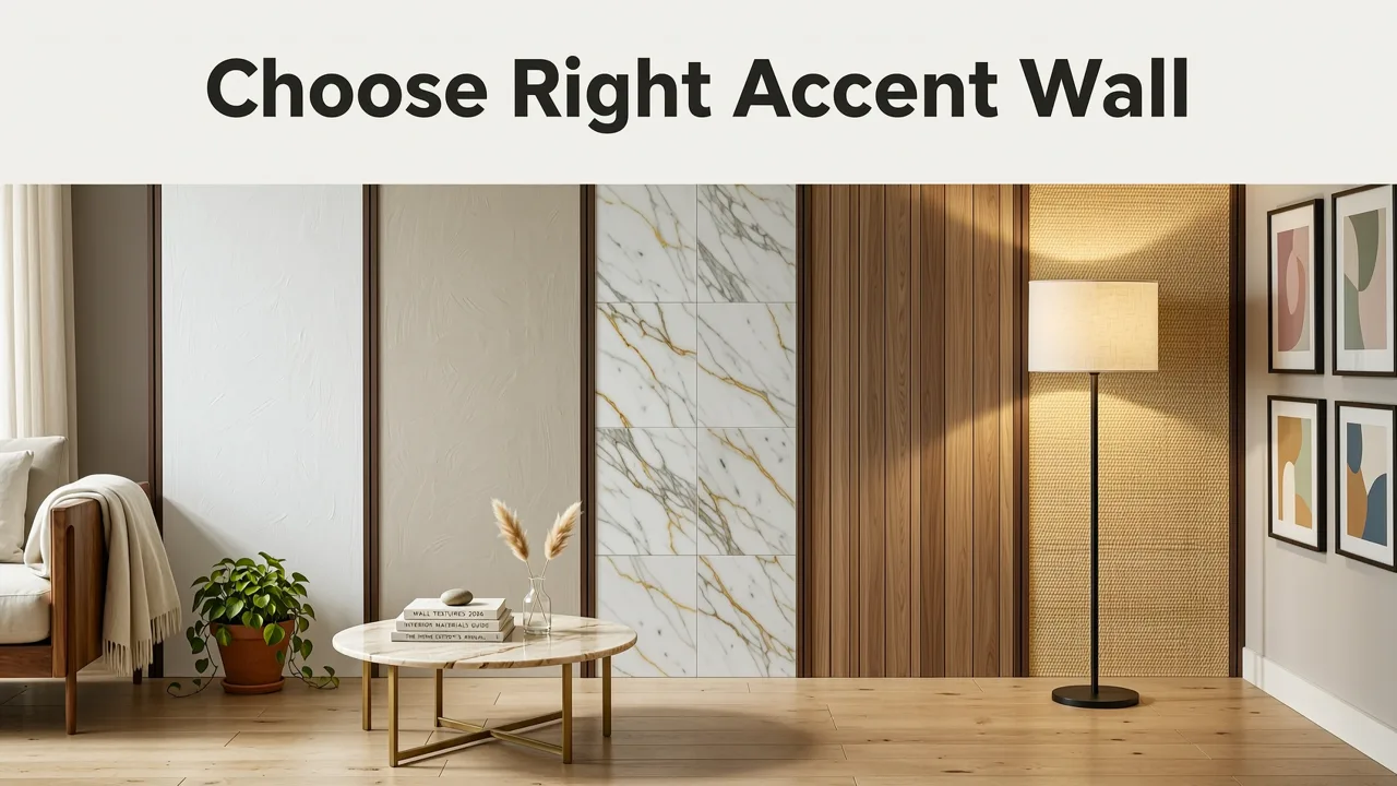
Before diving into specific colors, it helps to understand what makes an accent wall work. The goal is not just contrast—it is cohesion. A strong accent wall should feel like a natural part of the room, not a random splash of color.
Pick the Right Wall
The best accent wall is usually the one your eye lands on first when you enter the room. In a bedroom, that is typically the wall behind the bed. In a living room, it might be the wall behind the sofa or the one featuring a fireplace. In a dining room, consider the wall that anchors the table. Avoid accent walls broken up by too many doors or windows, as the visual impact gets fragmented.
Consider the Room's Light
Natural light direction changes how paint reads throughout the day. North-facing rooms benefit from warm accent tones—terracotta, amber, or warm olive. South-facing rooms can handle cooler, deeper shades like slate blue or forest green. If your room gets mixed light, test your top two or three choices using AI wall paint visualization to see how each looks under different lighting conditions.
Balance With Existing Elements
Your accent wall should complement, not compete with, your flooring, furniture, and textiles. Pull one or two undertones from existing pieces—say, the warm brown in a leather chair or the cool gray in a rug—and let the accent color echo or gently contrast with those notes.
25 Accent Wall Paint Ideas for 2026
The following ideas are grouped by mood so you can browse by the feeling you want to create. Each entry includes the color direction, best room types, and a pairing tip.
Calm and Grounded
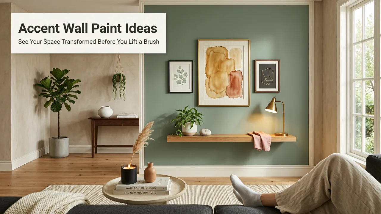
1. Warm Sage Green. A muted, yellow-leaning sage works beautifully in bedrooms and home offices. Pair with linen textiles and light oak furniture for a restful, biophilic feel.
2. Soft Clay. This dusty terracotta tone brings warmth without overwhelming. It is especially effective in living rooms with neutral sofas and natural wood accents.
3. Mushroom Taupe. A gray-brown with a subtle violet undertone. Ideal for bedrooms where you want depth without darkness. If you are working with a compact room, this pairs well with the strategies in our best white paint for small rooms guide for the surrounding walls.
4. Pale Oatmeal. Barely off-white with a golden undertone. Works as a subtle accent in rooms where you want warmth but not drama—think reading nooks and breakfast areas.
5. Foggy Blue-Gray. A desaturated blue with gray undertones. Perfect for bathrooms and bedrooms where calm is the priority.
Bold and Confident
6. Deep Forest Green. One of the most requested accent colors in 2026. Use it behind a bed or sofa and pair with brass hardware and cream textiles.
7. Midnight Navy. A near-black navy that reads as blue in daylight and near-black in evening light. Striking in dining rooms and studies.
8. Burnt Sienna. Rich, earthy, and warm. This terracotta-adjacent shade works in living rooms with Mediterranean or Southwestern influences.
9. Plum Noir. A deep, moody purple with red undertones. Best used in rooms with ample natural light to prevent it from feeling heavy.
10. Charcoal Graphite. A soft black that adds definition without the harshness of pure black. Excellent behind media consoles and in home offices.
Warm and Inviting
11. Honey Amber. A golden, warm tone that brings sunlight into north-facing rooms. Pair with rattan, cane, and cream for a relaxed, sun-drenched look.
12. Spiced Caramel. Deeper than honey amber with a brown base. Works in living rooms and hallways where you want enveloping warmth.
13. Rosewood. A muted, brownish-red that feels both vintage and contemporary. Ideal for dining rooms and libraries.
14. Baked Earth. A warm, ochre-leaning brown. Surprisingly versatile and pairs well with both cool and warm flooring.
15. Coral Clay. A softened coral with a matte, chalky feel. Works in bedrooms and sunrooms where you want energy without intensity.
Fresh and Modern
16. Eucalyptus. A cool, blue-green that feels clean and modern. Popular in bathrooms and kitchens as an accent behind open shelving.
17. Dusty Lavender. Desaturated and sophisticated, not childish. Works in bedrooms and dressing rooms paired with warm wood tones.
18. Slate Teal. A deep, gray-leaning teal that adds depth without darkness. Effective in home offices and media rooms.
19. Stone Blue. A classic, slightly grayed blue that pairs with virtually any neutral. A safe but not boring choice for living rooms and entryways.
20. Pistachio Cream. A soft, warm green with yellow undertones. Light enough for small rooms yet distinct enough to read as an accent.
Unexpected and Artistic
21. Oxidized Copper. A green-blue metallic-look finish that mimics aged copper. Best applied with a specialty finish or textured roller for a patina effect.
22. Limewash Pearl. A pearlescent limewash finish in a soft white or blush. Adds texture and subtle shimmer—ideal for bedrooms and dining rooms where you want quiet luxury.
23. Ink Wash Gray. A gray with a deliberate, slightly uneven application that mimics ink on paper. Works in creative spaces and studios.
24. Terrazzo Tint. Not a single color but a painted terrazzo effect using three to four complementary tones. A statement choice for powder rooms and entryways.
25. Color-Drenched Ceiling Accent. In 2026, the accent "wall" is sometimes the ceiling. Painting the ceiling a rich tone—deep green, moody blue, or warm terracotta—while keeping walls neutral is a growing trend, especially in bedrooms and dining rooms.
Accent Wall Colors by Room: A Quick Reference
| Room | Top Accent Picks for 2026 | Best Finish | Pairing Tip |
|---|---|---|---|
| Bedroom | Warm Sage, Deep Forest Green, Dusty Lavender | Matte or eggshell | Keep bedding in neutral linen tones to let the wall breathe |
| Living Room | Soft Clay, Charcoal Graphite, Stone Blue | Satin or matte | Anchor with a sofa in a complementary neutral |
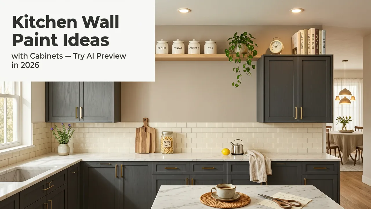
| Kitchen | Eucalyptus, Honey Amber, Pistachio Cream | Satin or semi-gloss | Use on the wall behind open shelving or a pantry zone |
| Dining Room | Midnight Navy, Rosewood, Limewash Pearl | Matte or limewash | Pair with a warm-toned wood table and soft overhead lighting |
| Home Office | Slate Teal, Mushroom Taupe, Ink Wash Gray | Eggshell or matte | Choose a tone that reduces screen glare and eye fatigue |
| Bathroom | Foggy Blue-Gray, Eucalyptus, Coral Clay | Satin or semi-gloss | Keep fixtures in brushed nickel or matte black for contrast |
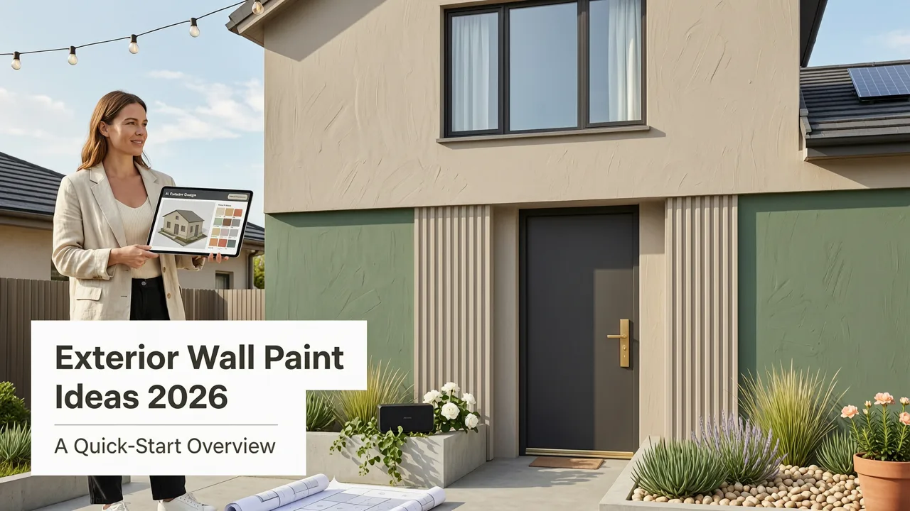
| Exterior Feature Wall | Deep Forest Green, Charcoal Graphite, Baked Earth | Exterior-grade matte | Use on a single facade section or entry surround; preview with exterior design visualization |
How to Visualize Accent Wall Colors With AI Before You Paint
The biggest advantage of 2026 is that you no longer have to guess. AI visualization tools let you upload a photo of your room, select an accent wall, and see it rendered in any color or finish in seconds. This is not a flat color overlay—it is a photorealistic preview that accounts for your room's lighting, shadows, and existing furnishings.
Step-by-Step Process
- Photograph your room. Use natural daylight and shoot from a corner to capture the widest angle. Make sure the wall you want to accent is clearly visible.
- Upload to an AI design tool. Choose a platform that supports room-specific visualization rather than generic image editing.
- Select the accent wall. Most tools let you tap or click to identify which wall you want to change.
- Choose your color or style. Browse trending palettes or enter a specific paint brand and color code.
- Review and compare. Generate multiple versions side by side. Pay attention to how the color interacts with your flooring, furniture, and natural light.
- Save your favorites. Export the versions you like and bring them to the paint store for real-world sampling.
This workflow eliminates the most expensive mistake in accent wall projects—committing to a color that looks wrong once it is on the wall. It also makes it easy to explore options you might never have considered, like a deep green or a limewash finish, because the cost of testing is zero.
Accent Wall Trends Shaping 2026
Beyond individual colors, several broader trends are shaping how accent walls are used this year:
- Textured finishes over flat color. Limewash, Roman clay, and micro-cement finishes are increasingly popular for accent walls because they add depth and tactile interest that flat paint cannot match.
- Warm, earthy saturation. The shift away from cool grays continues. Accent walls in 2026 lean into warm undertones—ochre, terracotta, moss, and warm brown—rather than sterile cool tones.
- Biophilic color stories. Colors drawn directly from nature—forest green, clay, stone blue, eucalyptus—remain dominant, reflecting a broader desire for calming, restorative interiors.
- Accent ceilings. As mentioned, painting the ceiling rather than a vertical wall is an emerging alternative, particularly in rooms with standard ceiling heights where a dark ceiling creates a cozy, enveloping effect.
- Multi-tone accent walls. Instead of one solid color, some designers are using two or three tonally related colors on a single wall—either in geometric blocks, vertical stripes, or a gradient wash—for a more artistic effect.
Common Mistakes to Avoid
Even with the best color choices, a few common errors can undermine an accent wall project:
- Choosing the wrong wall. A wall broken up by multiple doors, windows, or built-ins will not have the visual impact you want. Pick the most architecturally defined surface.
- Ignoring undertones. A gray that looks neutral in the store may pull blue, green, or violet on your wall. Always test in your actual lighting, or use AI visualization to preview.
- Over-accessorizing. An accent wall should be the focal point. If you add too many competing elements—busy art, patterned textiles, colorful shelving—the wall loses its impact.
- Using the wrong finish. Matte finishes absorb light and feel more sophisticated for accent walls. High-gloss finishes can work for specific design statements but tend to highlight wall imperfections.
- Skipping the preview step. In 2026, there is no excuse for painting a wall without seeing it first. AI tools make previewing fast, free, and accurate.
Extending the Accent Concept Outdoors
Accent walls are not limited to interiors. An accent-colored front door, a painted garden wall, or a bold color on a single exterior facade section can transform curb appeal. If you are considering an outdoor accent project, tools like the best AI garden design app let you visualize exterior color changes alongside landscaping updates so the whole property works together.
Final Thoughts: Test More, Waste Less
The 25 accent wall paint ideas in this guide represent the breadth of what is trending in 2026—from warm, earthy tones that cocoon a room to bold, moody shades that make a statement. But the specific color matters less than the process. The homeowners and designers who get the best results are the ones who test multiple options in their actual space before committing.
AI visualization has made that testing process faster, cheaper, and more accurate than ever. Instead of buying five sample pots and spending a weekend painting test swatches, you can explore dozens of options in minutes and narrow down to the two or three that truly work in your room.
Ready to see these accent wall colors on your actual walls? Upload a photo of your room to AI Interior Design and start visualizing your perfect accent wall today—no paintbrush required.